Let’s be honest. Most people don’t like clicking through a bunch of pages just to understand what you offer. They want the full gist fast, clear, and right there on one page. That’s exactly what a one-page website gives.
Whether you’re promoting a product, collecting leads, or showing off your skills, a single scrollable page can get the job done if you build it the right way.
Let me show you how to create a one-page website that doesn’t just look nice but actually makes people take action.
First Things First: What’s a One-Page Website?
It’s exactly what it sounds like. A website that fits everything you need to say on just one page. Instead of clicking through About, Services, Pricing, and Contact, the user just scrolls.
But here’s the trick. Everything needs to flow like a good story. You’re guiding the visitor from curiosity to trust to action.
Why Use a One-Page Website?
You don’t always need a big fancy site. Here are some reasons to keep it simple:
- You’re promoting one product or service
- You want people to focus on one thing
- You need it to load fast and work well on mobile
- You’re just starting out and want something quick
- You want people to do something, not just browse
One-page websites are also easier to build and manage, especially if you’re doing it yourself.
Step-by-Step: How to Build a One-Page Website That Gets Results
Let’s break it down like we’re building together.
1. Decide What You Want People to Do
This is your most important step. Ask yourself:
What’s the one thing I want my visitors to do?
- Sign up
- Book a call
- Buy something
- Download a freebie
Pick one. Just one. That’s your goal, and everything else on the page should support it.
2. Sketch It Out First
Don’t start building right away. Just grab a paper or open Canva or Figma and sketch how you want things to look.
The flow usually looks like this:
- A bold intro section (your hero)
- What you do or offer
- Why it’s awesome (features or benefits)
- Social proof (testimonials, reviews)
- Pricing or offer details
- Common questions
- Contact or final sign-up section
It’s like telling a story that ends with a clear Yes, I want this.
3. Nail the First Section (Hero Section)
This is the first thing people see. It can make or break the whole experience.
You need:
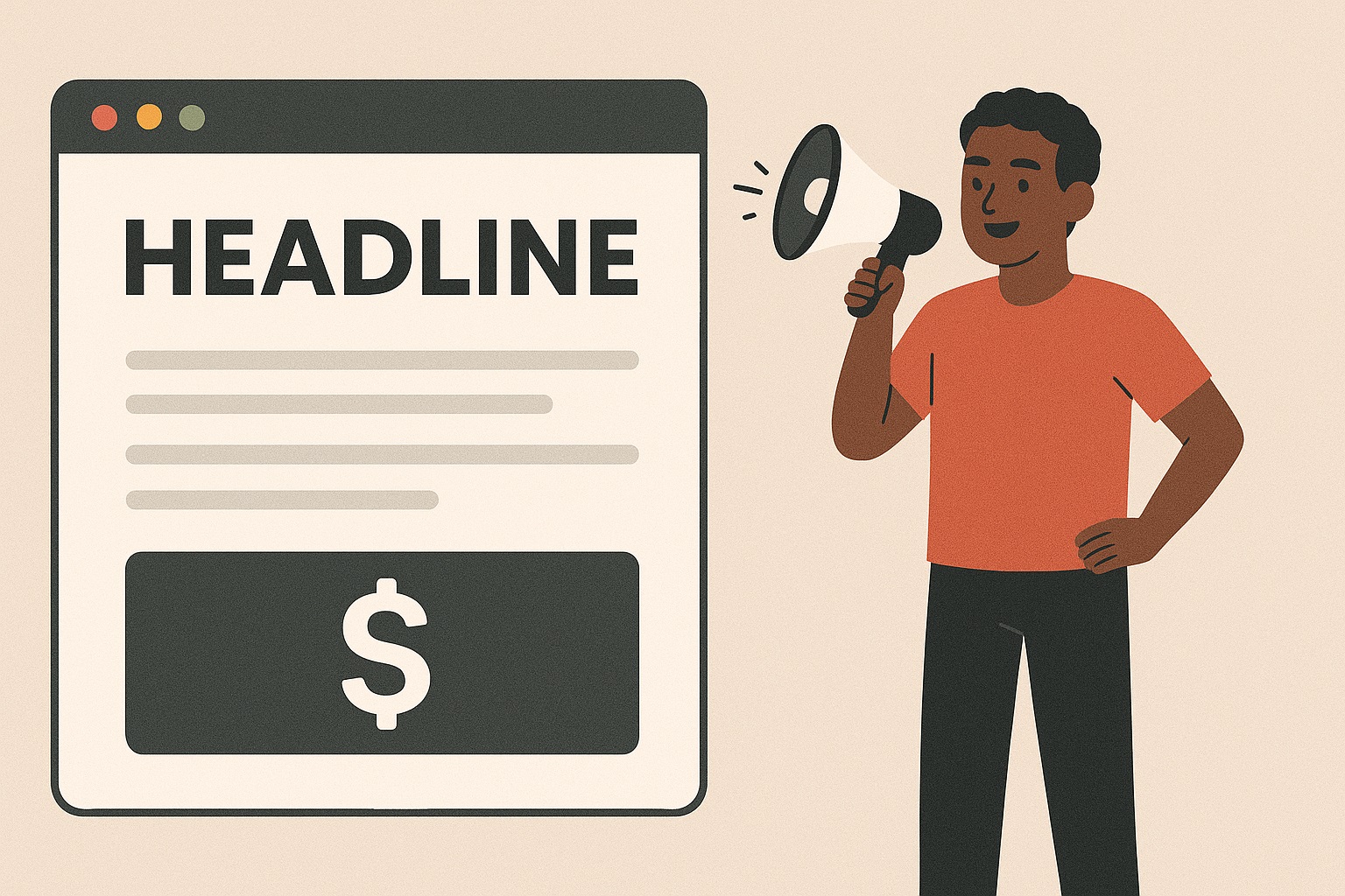
- A short, punchy headline
- A quick sentence that explains the benefit
- A clear button that tells people what to do
Example:
Headline: Build Your Dream Website Without Coding
Subtext: Our beginner-friendly builder helps you go live in less than an hour
Button: Start for Free
No deep grammar. Just real talk that makes someone want to scroll down.
4. Keep It Simple and Easy to Scroll
Nobody likes a site that feels heavy or confusing. Keep it clean.
- Use short paragraphs
- Space things out
- Use big buttons
- Keep colors calm and readable
- Avoid tiny text
Always test it on your phone. If it doesn’t look great there, fix it.
5. Focus on One Action Only
It might be tempting to ask people to follow your socials, join your newsletter, book a call, and buy now. But don’t.
Stick to one goal.
Repeat your call-to-action button in different places on the page, but always with the same message. Don’t confuse people. Guide them.
6. Add Proof That You’re Legit
People don’t trust easily. Show them others have tried you and loved it.
You can add:
- Short testimonials
- Star ratings
- Before and after pictures
- Trusted by logos
- Real names and faces
Even if you’re just starting, one or two happy users can go a long way. Or give something free to your first few visitors in exchange for honest feedback.
7. Use Design Tricks That Help People Keep Scrolling
People are lazy scrollers. You have to guide their eyes.
- Use arrows or subtle animation
- Switch background colors to break sections
- Keep text short and bold
- Use friendly icons or photos
Break your content into small chunks that are easy to skim.
8. Make It Load Fast and Look Good on Mobile
If your page takes forever to load, most people will leave before they even see it.
Do this:
- Compress images
- Use fewer fancy effects
- Avoid heavy fonts or plugins
- Test the page on your phone and tablet
Speed and simplicity win.
9. Talk Like a Human Being
Forget the corporate buzzwords. Use real words people understand.
Don’t say:
We streamline productivity through scalable solutions.
Do say:
We help you finish your tasks faster without tech stress.
Your reader should feel like you’re talking directly to them.
10. Add a Little Urgency (Without Being Pushy)
Sometimes people need a small nudge. Try things like:
- Only 3 spots left this week
- Free bonus ends tonight
- Limited to 20 people per batch
Just be honest. Fake urgency is easy to spot and it kills trust.
11. Track What’s Working
Once you’re live, don’t forget the site. Watch how people use it.
Use free tools like:
- Google Analytics for traffic
- Microsoft Clarity to see where users click and scroll
- A/B tests to try different headlines or buttons
One small change can increase conversions. Don’t be afraid to try.
12. Don’t Forget SEO
Even though it’s one page, you can still show up on Google.
- Use a clear title and meta description
- Add your main keyword in a few spots
- Use image alt text
- Add a short FAQ or How it works section
These small things make a big difference.
13. If You’re Not Selling Yet, Collect Emails
Maybe your product or service isn’t ready. That’s okay.
Use the site to collect emails so you can reach out later. Offer something small:
- A free checklist
- A sample
- Early access
- A discount code
Use tools like ConvertKit or MailerLite. They’re free to start.
Bonus: Tools You Can Use to Build It
You don’t need to hire a developer. These no-code tools make it easy:
- Carrd: Cheap, clean, and great for beginners
- Framer: Sleek with beautiful animations
- Elementor: Powerful for WordPress users
- Webflow: Very professional look and feel
- Dorik: Simple and easy to use
Choose one, pick a template, and start building.
Real-Life Ideas for One-Page Sites
- Promote your product with a demo and buy button
- Offer freelance services and a booking form
- Host an event or webinar with registration
- Showcase your personal brand and contact info
One-page sites work for almost anything as long as they’re clear.
Final Thoughts
One-page websites are simple but powerful. They’re easy to create, fast to load, and very focused. If done right, they guide people toward one goal and help you get results faster than a big complicated site.
Keep it clean. Make it readable. Write like you’re talking to a friend. Focus on one action and lead your visitor all the way there.
And don’t stress about perfection. You can always tweak and improve after going live.


